We've all been there - you're scrolling through a brand's feed, vibing with their aesthetic one minute, only to get total whiplash the next post over. Suddenly the colours are different, the fonts are clashing, and you're left wondering "...wait, is this even the same brand?" Yep, the struggle of maintaining a consistent brand identity that doesn't induce whiplash in your audience is super real. But avoiding it is low-key crucial for cultivating brand recognition and nurturing those all-important "know, like and trust" vibes with your people.
So what exactly causes this dreaded "branding whiplash"? And more importantly, how can you sidestep it entirely to create an owning-your-aesthetic brand experience that's smooth as butter? Let me dive in.
The Culprits Behind Branding Whiplash
There are a few key offenders that can throw your brand identity into a tailspin of mixed visuals and confusing misalignment: Mismatched Colour Palettes, we've all been there - you find the most gorgeous new colour scheme and instantly want to splash it all over your brand's aesthetic. But making drastic palette swaps without a second thought is a one-way ticket to whiplash town. Your brand colors aren't just there for looks (though looking fly is a definite perk). They're carefeully chosen hues that reflect your brand's personality and elicit specific emotional responses in your audience. Abruptly switching them up without intention can completely disrupt your vibe and disconnect your visuals from your messaging.
Clashing Font Pairings
Similarly, your brand's typography acts as a subtle emotional cue that shapes how your audience perceives your brand's voice and traits. Using elegant, refined fonts for a playful, lighthearted brand? Whiplash incoming. Opting for bold, industrial-style typefaces to rep your eco-conscious sustainable biz? Not exactly an aligned vibe. When your font choices clash with your intended brand personality and messaging, it creates a disjointed, confusing experience for your audience. Those mixed signals can quickly muddy your brand's identity in their minds.
Inconsistent Visual Elements
While colours and fonts are the biggest culprits, any kind of inconsistency in your brand's core visual elements can induce whiplash. From graphics and patterns to photography styles and iconography - when these supporting pieces don't feel cohesive, your overall brand aesthetic loses its harmony. Your audience starts to feel unmoored and disconnected from your brand identity. And that's the last thing you want when you're trying to cultivate consistent brand recognition and loyalty.
The Solution: Intentional Brand Cohesion
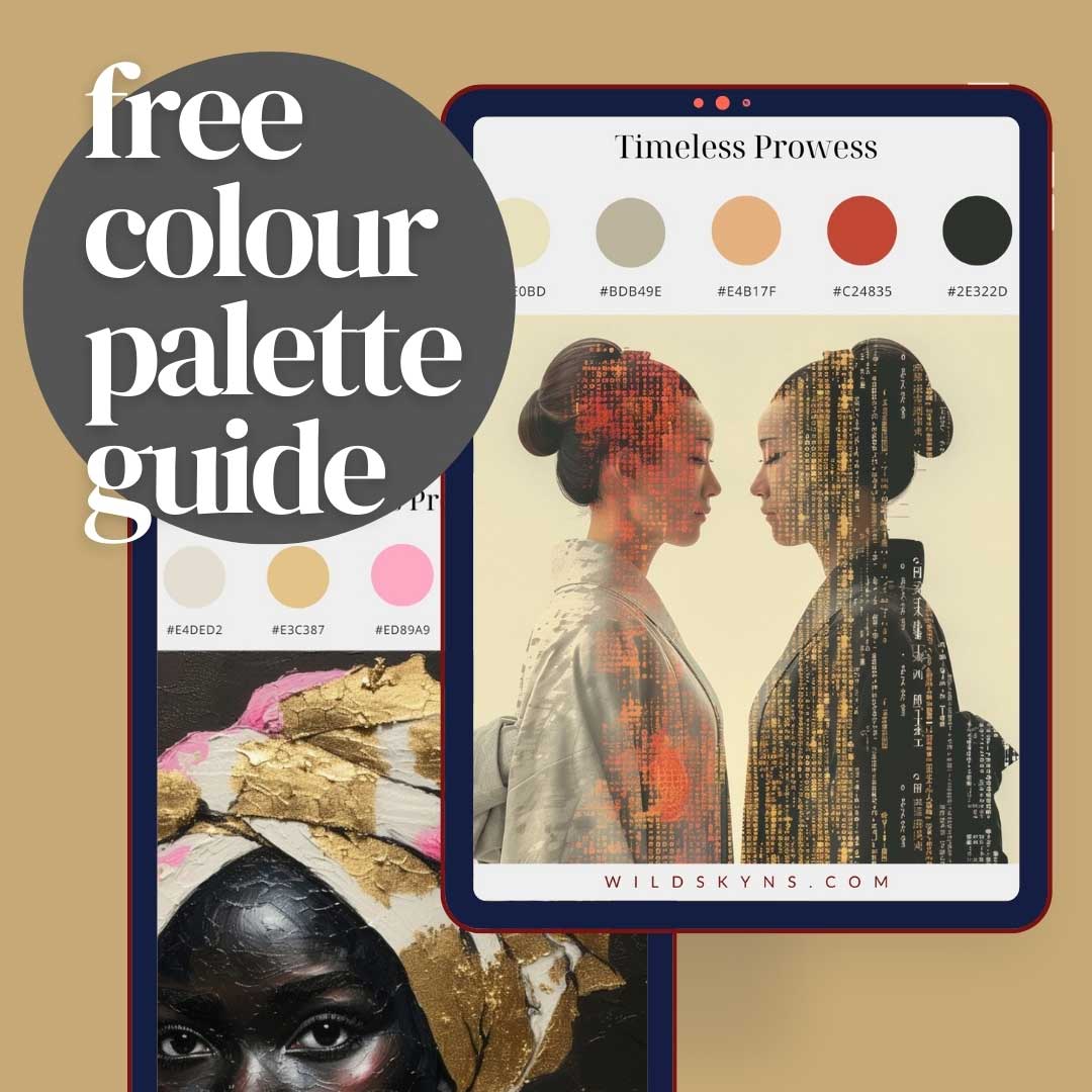
So how can you avoid subjecting your precious audience to a never-ending cycle of branding whiplash? By getting intentional about cohesive brand alignment from the jump! Define Your Aesthetic Intention Before you can achieve visual harmony, you need to get crystal clear on your brand's core identity and the aesthetic you want representing it. What vibe are you going for - fun and playful, luxurious and high-end, eco-conscious and grounded? Get specific about your brand's personality traits and desired emotional associations. From there, you can carefully select a color palette, typography, and supporting visual elements that reinforce and elevate that defined brand identity. Everything should feel strategically aligned to create an intentional, cohesive aesthetic experience. Create a Brand Style Guide With your aesthetic vision defined, bring it to life in a comprehensive brand style guide. This living document should outline all the core visual elements of your brand identity and how to apply them consistently. Include specifics like your brand colors and their exact HEX codes (colours that websites understand), your approved font pairings and typography hierarchy, your logo suite and guidelines for using it across different contexts, and any other visual rules or applications to maintain cohesion. Essentially, this guide becomes the holy grail of your brand's visual identity - the one-stop-shop for ensuring consistency in every single application. It keeps everyone on your team aligned and accountable to your defined aesthetic.
Implement Approval Processes
Of course, even with your brand style guide on lock, inconsistencies and whiplash-inducing visuals can still slip through the cracks. A key part of the solution? Implementing a review and approval process for anything going out into the world representing your brand. Before any new website designs, social media graphics, marketing materials or other branded visuals get published, they should go through a checkpoint. Having a designated team member (or an outside expert) review all visual assets for adherence to your brand guidelines can save you from costly inconsistencies. It's just one more line of defense against those dreaded "...wait, is this even the same brand?" moments. The Bottom Line At the end of the day, avoiding branding whiplash is all about being proactive and intentional with your brand identity from the very start. By defining a cohesive aesthetic vision, documenting your guidelines, and implementing quality control processes - you can create a unified, harmonious brand experience that's consistent across every touchpoint. It's the secret sauce for cultivating seamless brand recognition and nurturing a deep, lasting connection with your audience. No whiplash required.