You know that old saying "don't judge a book by its cover"? Well, when it comes to branding and marketing, judging things based on looks is human nature, my dears. It's called the aesthetic usability effect, and understanding this psychological phenomenon can be a total game-changer for elevating your brand positioning and standing out in crowded markets. The aesthetic usability effect describes people's tendency to perceive aesthetically pleasing designs as being more usable, effective and valuable - even if the actual functionality is the same as a less attractive option. Crazy, right? Our brains are essentially hardwired to believe that good looking = good performing. It's why we're more likely to trust a beautifully plated dish at a restaurant over something haphazardly thrown together, even if they theoretically taste the same. Or how we might judge that book by its cover design and assume the content inside matches the outside vibe. Subconsciously, we all do this judging of quality, credibility and overall experience based on aesthetics alone. And in today's crowded online space, having a striking visual brand identity isn't just for show - it's a powerful way to instantly build trust, credibility and perceived value with your audience before they even experience your product or service.
To better understand how the aesthetic usability effect works, let's look at a real-world example: Imagine you're browsing websites for a new skincare line to try. You land on two different brand sites - one with a modern, cohesive look with beautiful product photography and a clean, engaging layout. The other is pretty outdated, with mismatched fonts, clashing colors and an overall disorganized, unprofessional feel. Even if both brands offer similar products with comparable ingredients and formulations, you're likely going to be subconsciously drawn toward and trust the brand with the aesthetically pleasing, well-designed website - that's the aesthetic usability effect in action. Their polished, intentional brand presence signals to your brain: "This is a credible, trustworthy, high-quality brand." Whereas the outdated, unattractive site subcommunicates the opposite: "This brand seems unprofessional and not worth my money/time." Your perception of each brand's value and experience is being shaped almost entirely by the visual aesthetics before you've even had a chance to learn about their products or philosophies. And in a saturated market, that first impression and gut reaction means everything for standing out from the crowd. Using Aesthetics to Your Advantage When you understand the powerful role aesthetics play in shaping audience perceptions, you can be highly intentional about leveraging visual branding to your advantage. Think of your brand identity like that tantalizing plate of food or beautifully designed book cover. If it looks deliciously good and well-crafted on an aesthetic level, potential customers/clients will automatically assume the experience of working with your business will be equally impressive. It's the ultimate first impression hack! By nailing the aesthetic usability effect, your brand essentially gets to show up wearing its "Sunday best" every single day. Those elevated visuals act as a psychological shortcut that primes your audience's perception of quality and credibility before you even have a chance to pitch your offerings. Of course, you'll need to back up that initial visual wow-factor with a top-notch product/service experience to retain customers long-term. But nailing your brand aesthetics to leverage the aesthetic usability effect? That's the key to getting their foot in the door and making an unforgettable first impression that elevates your entire brand positioning from the start.
So what does nailing those intentional aesthetics actually look like? It starts with a few core visual elements:
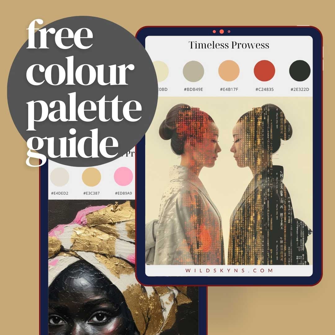
A Cohesive, Memorable Colour Palette
Colour accounts for up to 90% of a person's initial judgement about a product or brand. The shades you choose shape the emotional associations and personality traits your audience subcommunicates about your brand. For example, bright, vibrant hues like yellows and oranges can convey energy, playfulness and happiness. Blues and greens often feel more trustworthy, calming and focused on wellness/nature. Luxe brands frequently use rich shades like burgundy, gold or plum to communicate sophistication and high quality. The key is choosing a cohesive palette that aligns with the vibe and personality you want your brand to embody. Those hues should then be used consistently across all your branding elements from your website and social presence to your packaging and physical products.
Unique, Distinctive Typography
Similarly, the fonts you use shape your audience's perception of your brand voice and core traits. Typography has a powerful way of subcommunicating things like playfulness or professionalism, luxury or approachability. Would you trust an eco-friendly, sustainable brand using an overly industrial, rigid font? Probably not - that visual disconnect would make you subconsciously question their credibility and values alignment. On the flip side, a high-end luxury brand using a playful, child-like typeface would just feel off and could undermine their premium positioning. The most effective brand identities ensure their font choices evoke the same personality and attributes they want to be known for. It's a subtle but powerful way to reinforce their entire brand narrative through strategic design.
Engaging Graphics, Patterns & Photography
Beyond your core color palette and typography, elements like graphics, patterns, illustrations, icons and photography styles also play a big role in shaping your brand's overall aesthetic and personality. Custom graphics and patterns infuse a brand with a unique, ownable look that helps it stand out. While photography styles can reinforce your brand's voice - think bright and airy for an approachable, lighthearted vibe or richer, moodier tones for something more luxurious and editorial. The key is ensuring all of these supporting visual elements work in cohesive harmony with your color palette, typography and core brand identity. Consistent, intentional aesthetics across every single touchpoint. An Elevated, Polished Presence Finally, the overall quality and polish of your brand presence plays a big role in the aesthetic usability effect. A brand's visuals that feel thoughtfully well-designed and professionally executed will automatically convey a higher level of credibility, value and status. Whereas an aesthetic that feels disjointed, outdated or thrown together haphazardly will subcommunicate the opposite - lack of attention to detail, lower quality, unprofessionalism. Not exactly what you want your brand identity to represent! From the quality of your brand photography and graphics to the layout of your website and printed marketing materials - every single visual element should feel elevated, cohesive and on-brand. It's what allows your business to show up looking (and being perceived as) its best day in and day out.
The Bottom Line
At the end of the day, the aesthetic usability effect proves that first impressions and snap judgments based on aesthetics alone have a powerful impact on your brand's positioning and ability to attract your ideal audience. By being intentional and strategic about crafting an elevated, cohesive, memorable visual brand identity that aligns with your brand's personality and values, you can leverage this psychological phenomenon to your advantage. Those polished aesthetics act as a shortcut for building credibility, perceived value and making an unforgettable first impression that stands out from the crowd. So whether you're an established business in need of a rebrand or just starting to build your brand presence, get intentional about those aesthetic details! Craft an owning-your-aesthetic identity that instantly elevates your credibility and positions you as the premium, polished option in your market. Because in today's crowded online space, people really are judging that book by its cover. Having a brand that looks as good as it performs gives you a powerful psychological edge right out of the gate.